Branding
Packaging
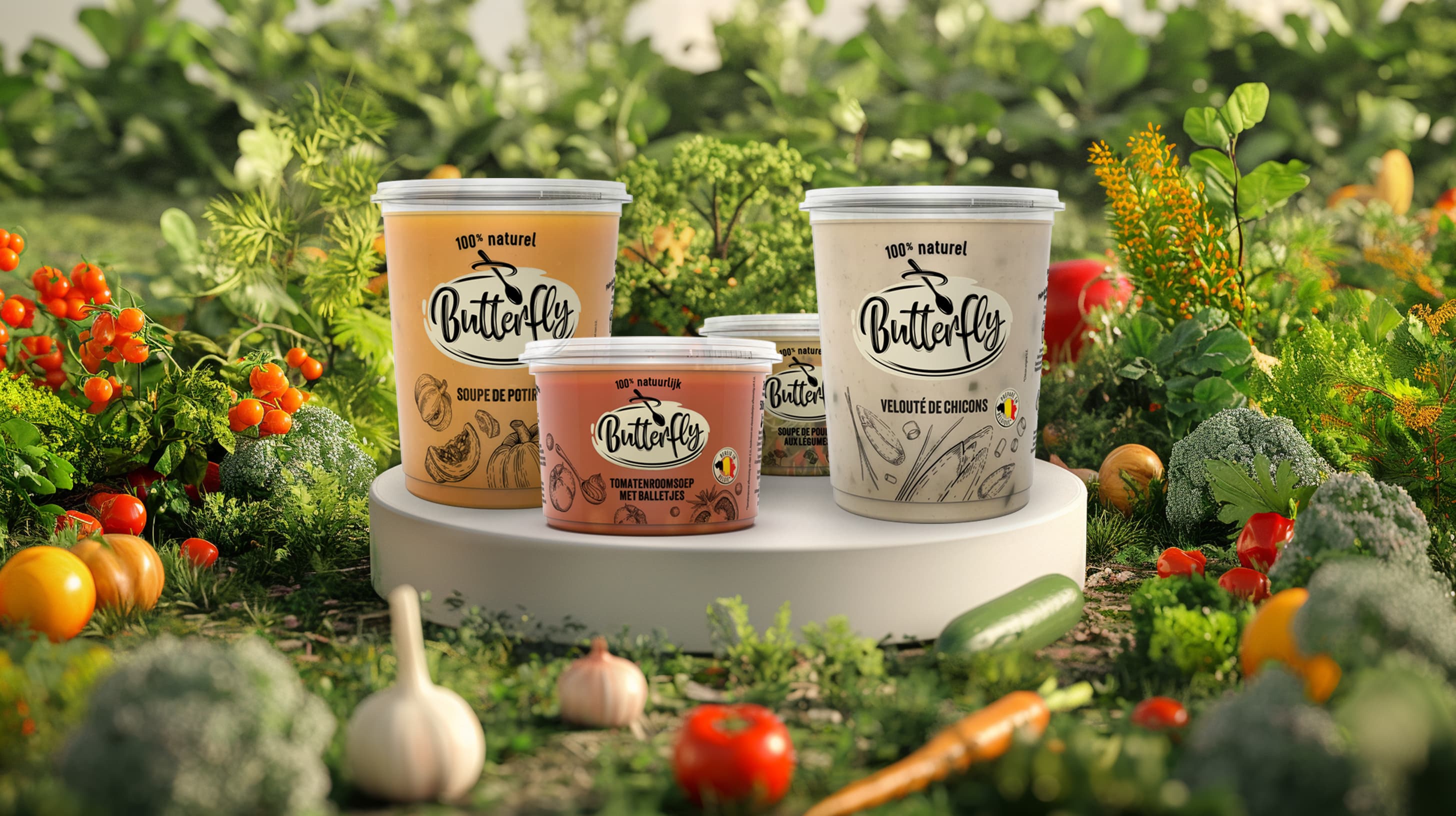
BCS Butterfly
100% Belgian, 100% natural
Making Fresh, Natural Soup Stand Out on Shelf
Butterfly has long been known for healthy, 100% natural soups that taste just like homemade. As the ready-made soup category became increasingly crowded, the brand faced a clear challenge: strengthen its position as an authentic, natural choice for homemade soup lovers, while standing apart from private labels and remaining instantly recognizable to loyal customers.
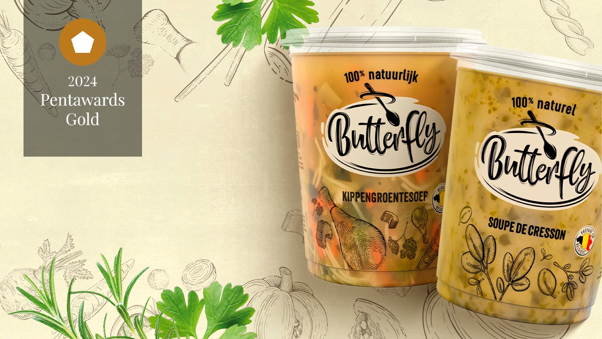
We understood that consumers are looking for convenience without compromising on freshness, transparency, or taste. To answer this, we reimagined the Butterfly brand from the ground up, creating a completely new identity and packaging system centered around simplicity, natural goodness and authenticity. Distinctive illustrations were developed from scratch to reinforce the homemade character of the soups, while transparent design elements highlighted the quality and purity of the ingredients. Alongside the redesign, we also developed a video sales tool to support the brand story and strengthen commercial impact.
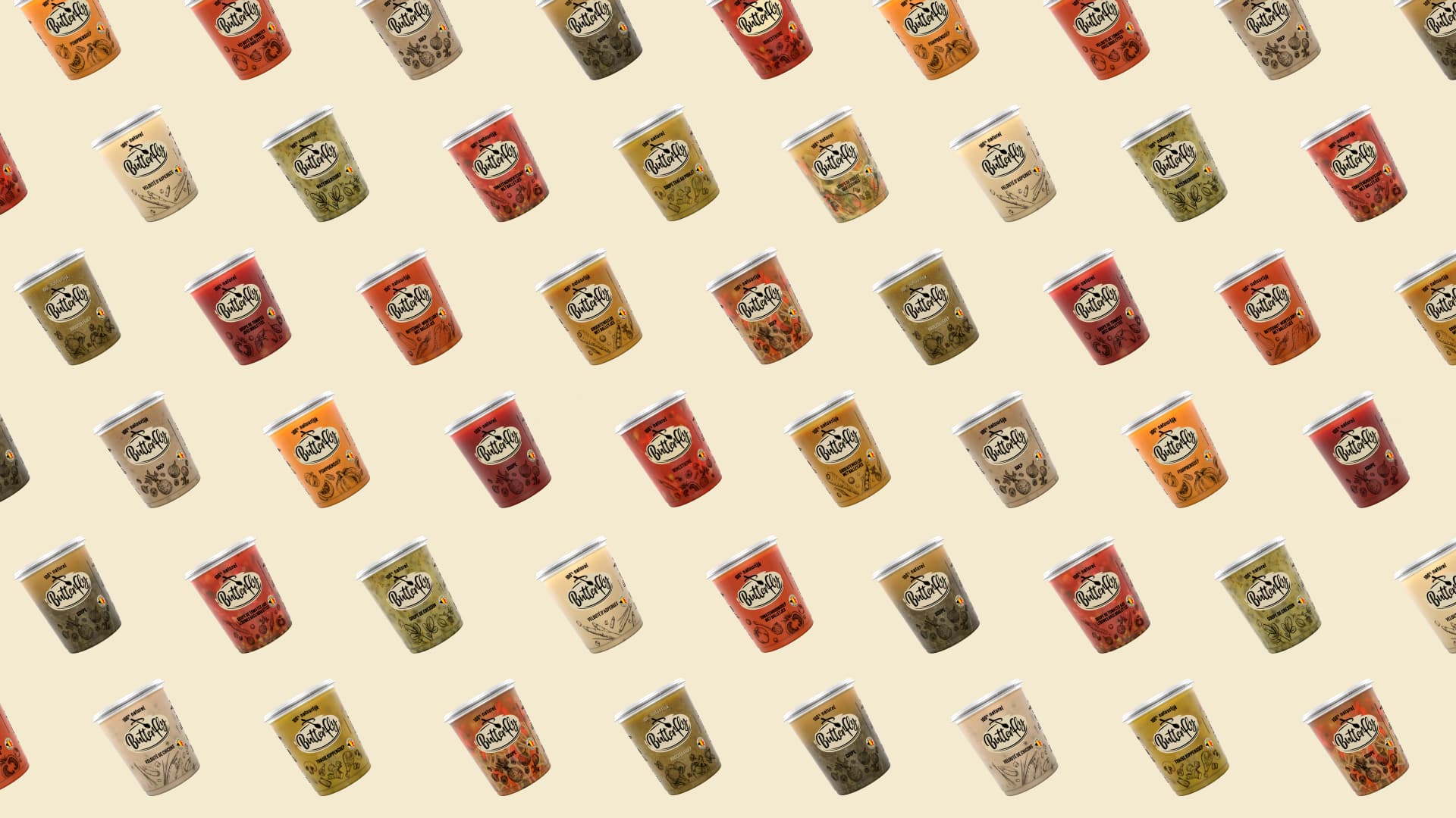
The result was a bold new brand world that successfully elevated Butterfly’s presence on shelf while strengthening its emotional connection with consumers. The redesign delivered strong commercial results, generating +8.3% volume share and +28.7% moving annual total. The work was further recognized with a Gold at the Pentawards 2024 in the Design Performance category, reinforcing Butterfly’s position as a distinctive and modern leader in the natural soup category.