packaging
Delhaize
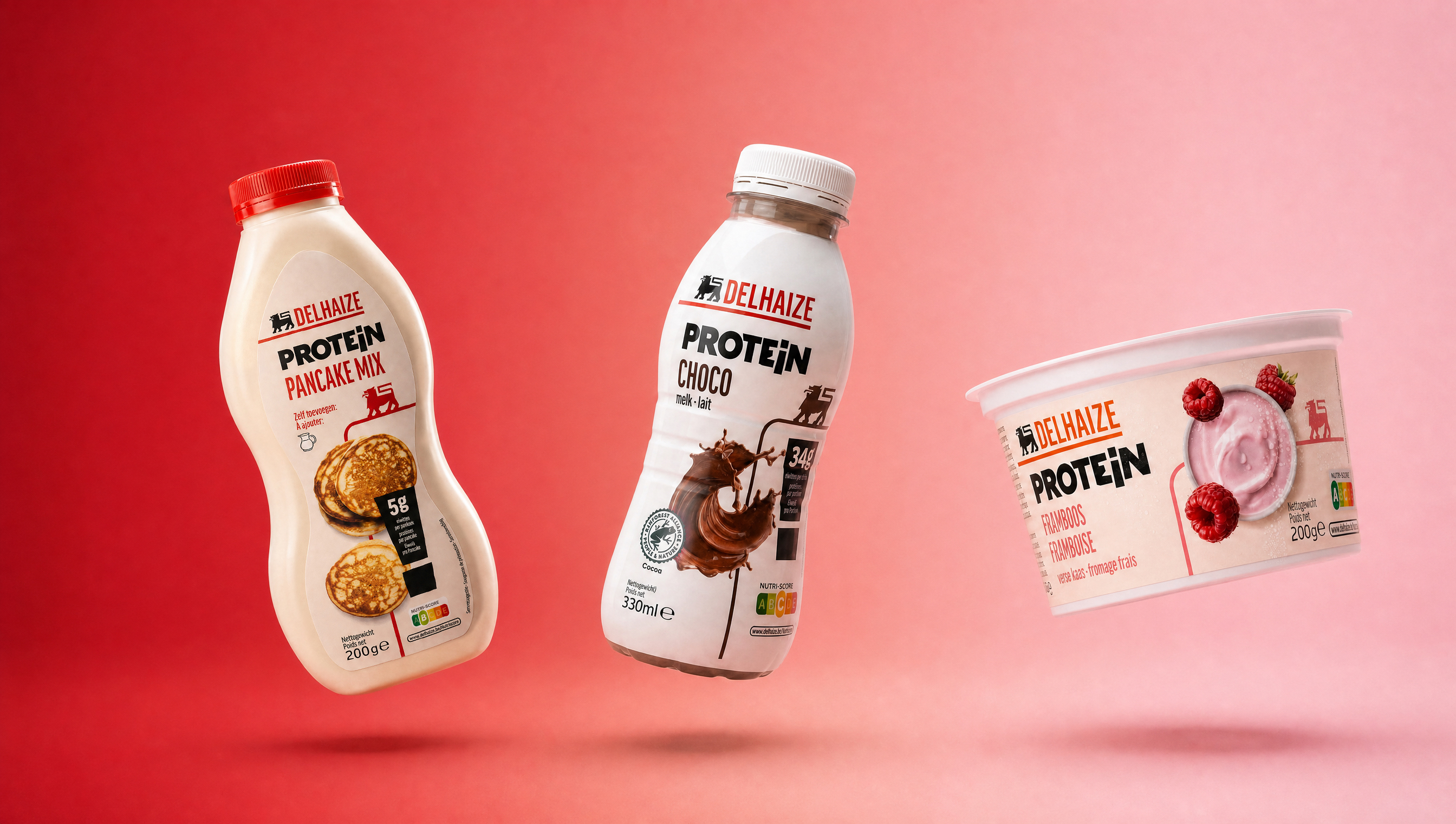
Protein Range
Turning a specialised category into an everyday shopping habit
Delhaize saw a shift in how consumers approach nutrition: shoppers no longer wanted to seek out a specialised aisle for protein-rich products, they expected these products to fit naturally into their everyday routine. For the Delhaize protein range, we needed a design system that could sit comfortably within the global brand architecture while still standing out clearly enough to do its own job on shelf.
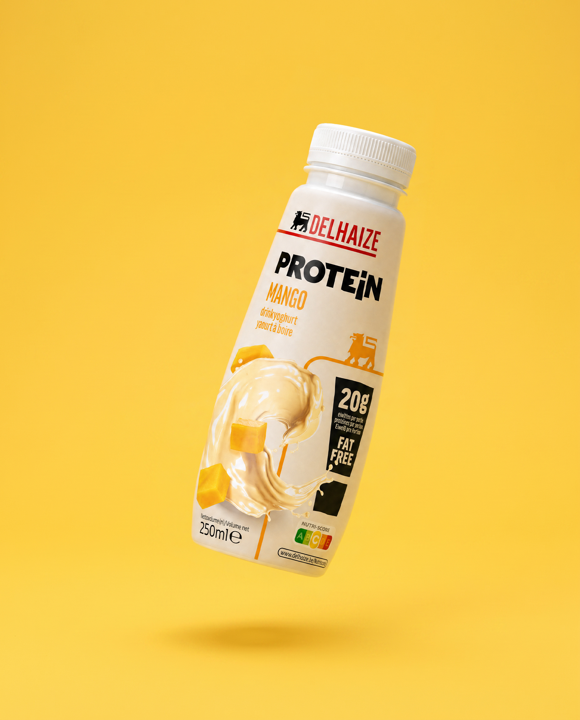
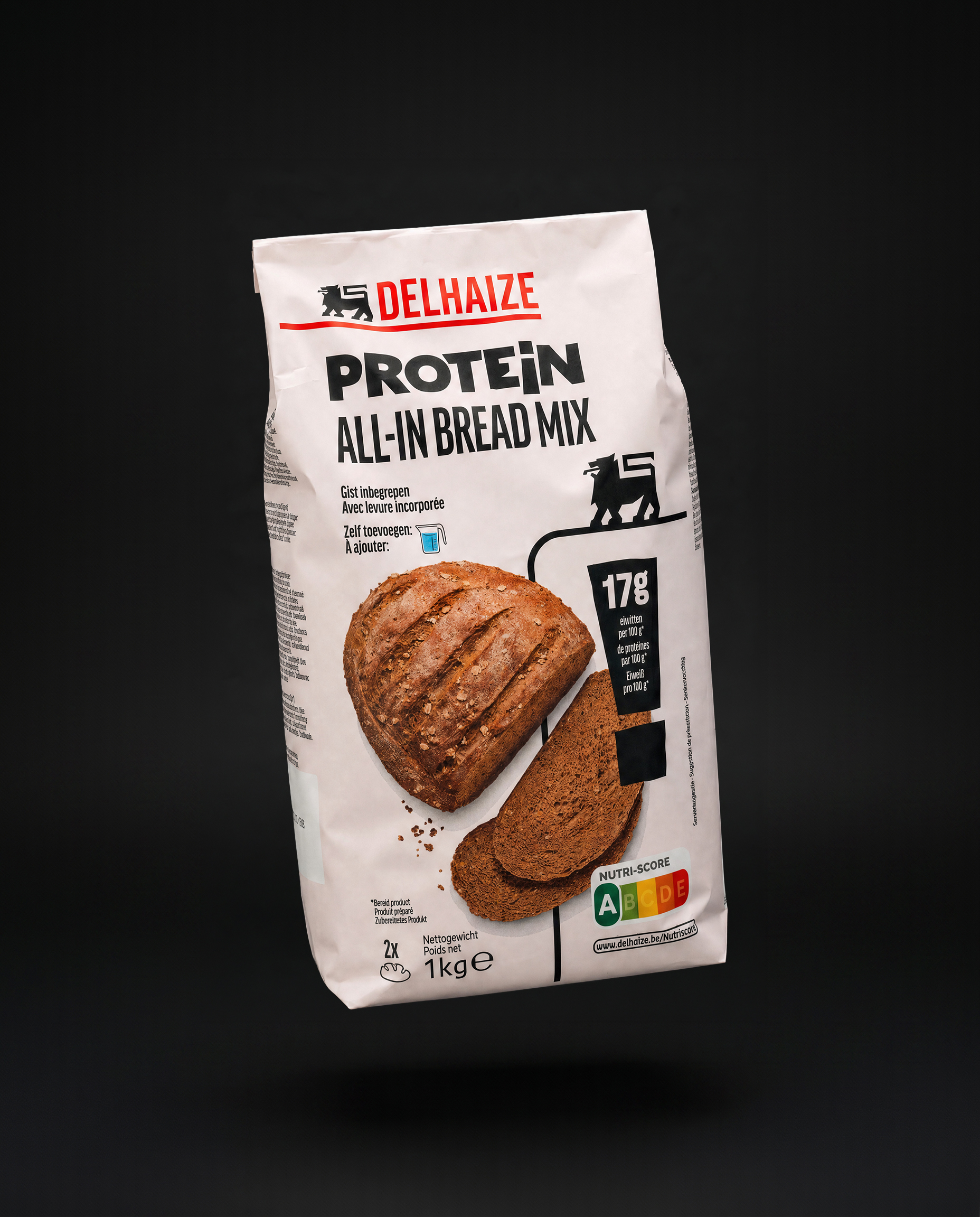

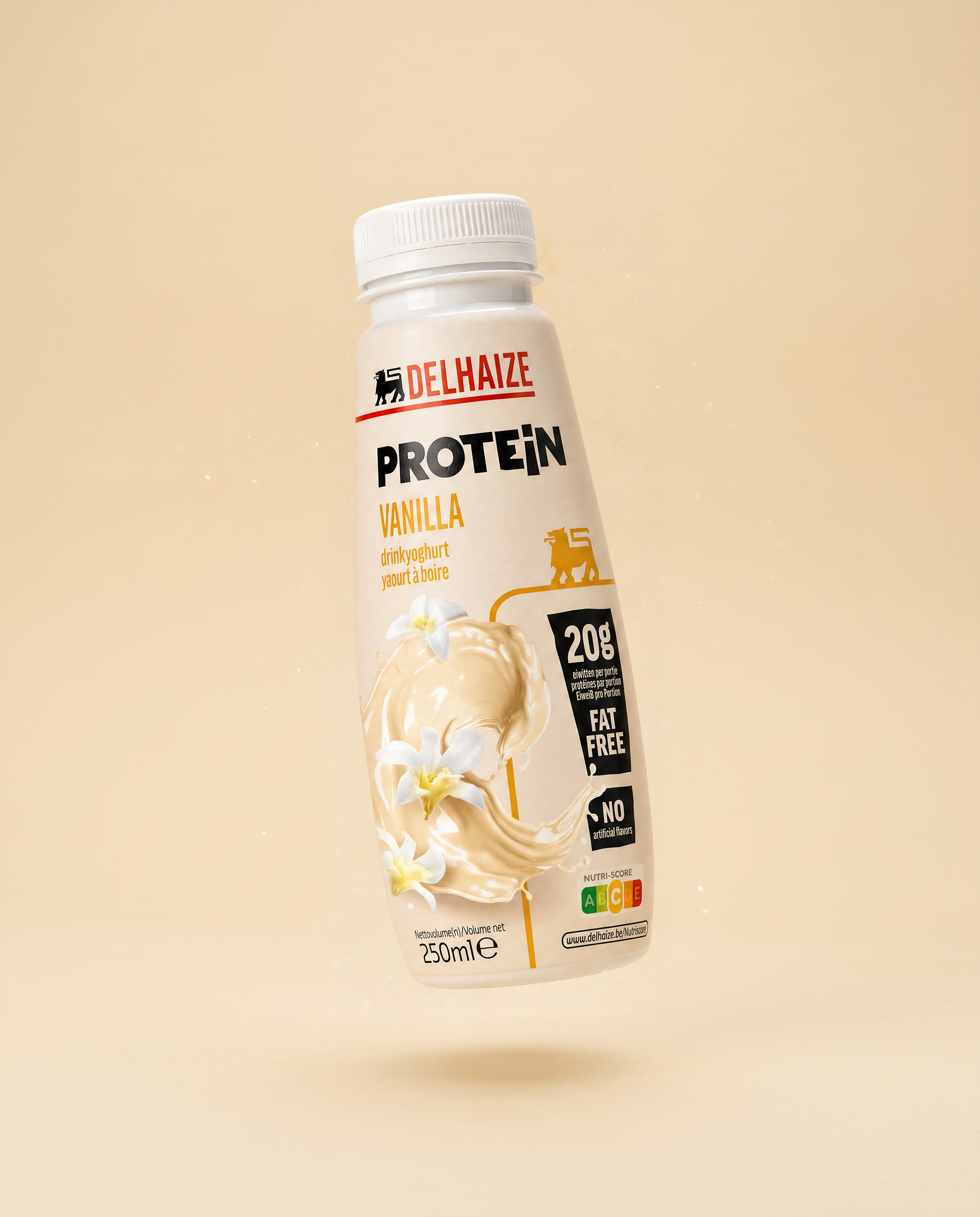
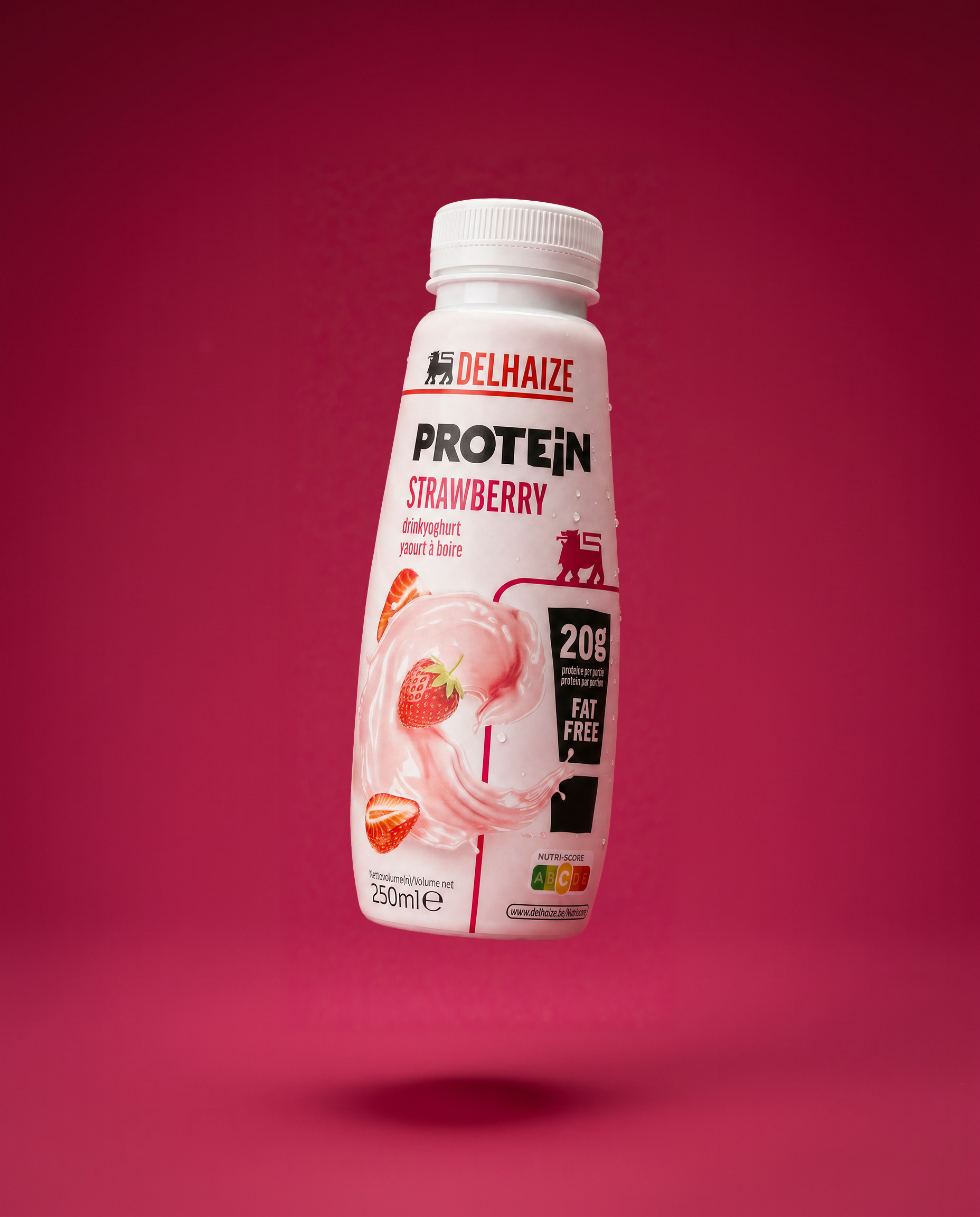
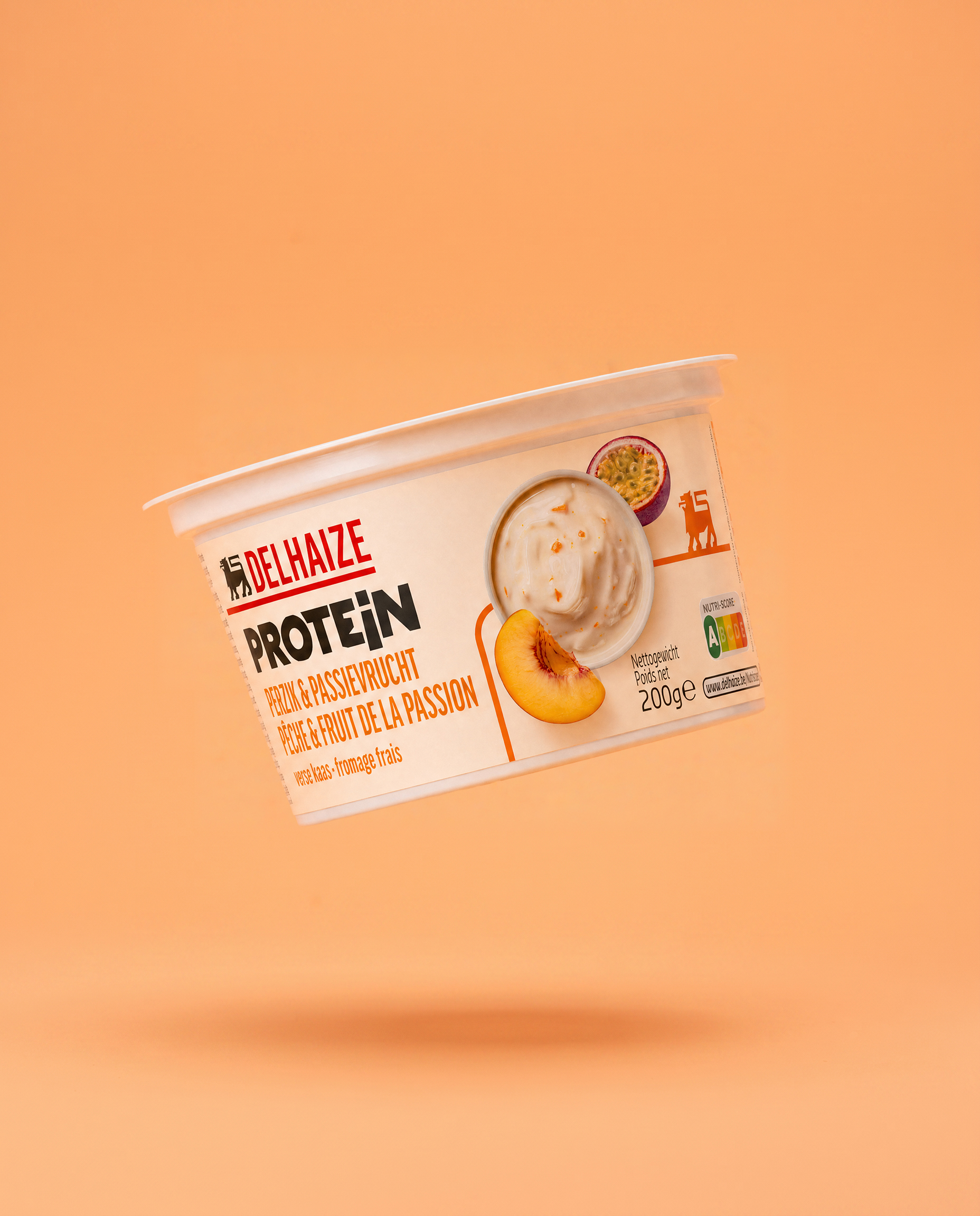
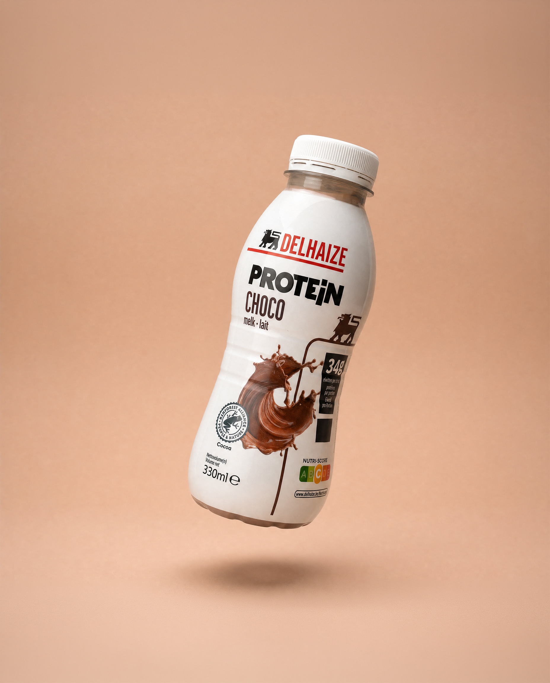
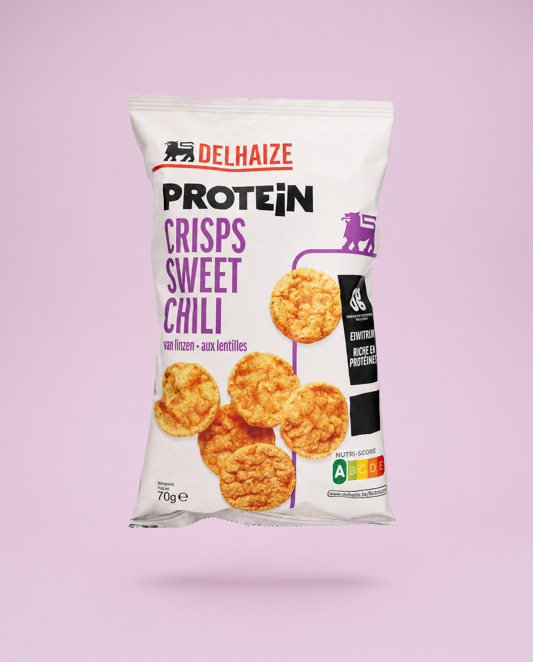
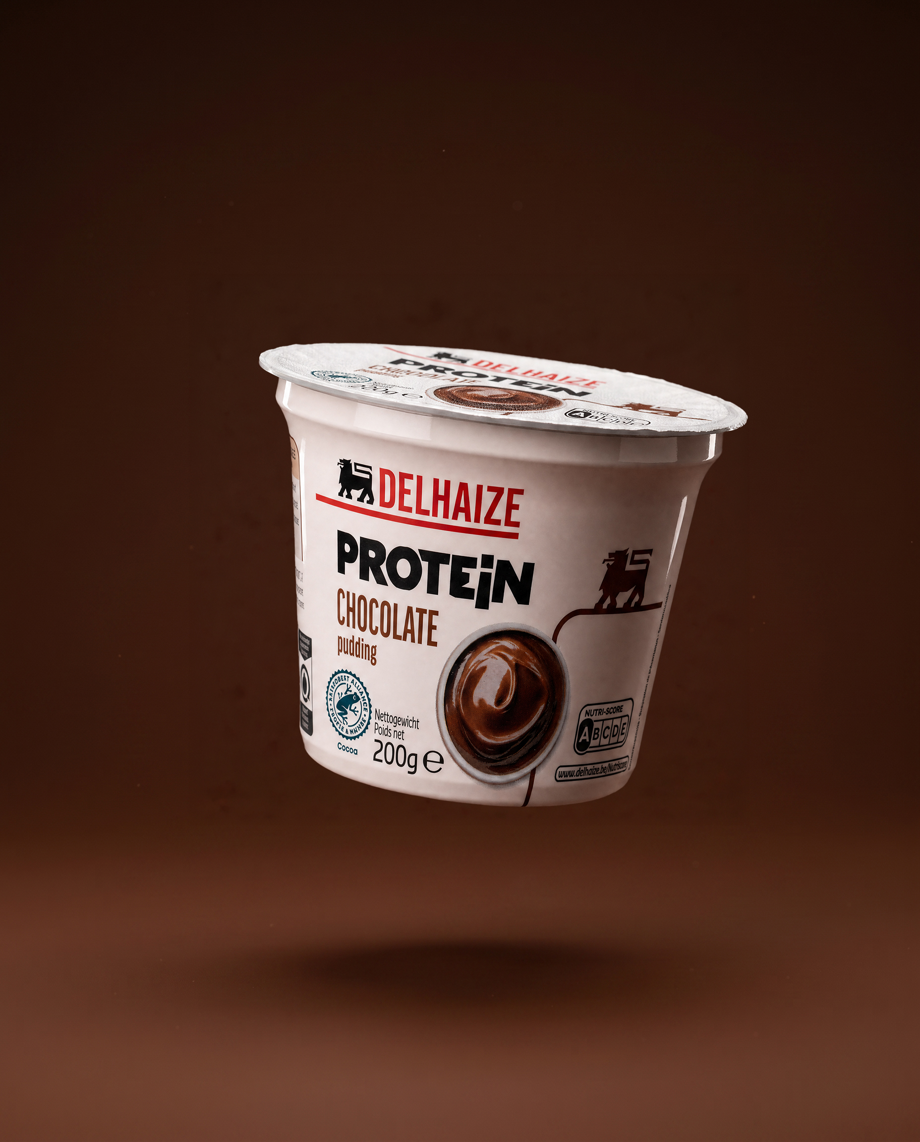

We understood that the real barrier to entry wasn't product choice, it was navigation. Protein products had long lived in a category shoppers had to actively search for, which limited their reach to only the most motivated buyers. The opportunity was to remove that friction entirely: clear typography, visible protein counts, and a simple visual hierarchy that let shoppers spot and understand the range at a glance, without needing to slow down or ask questions. Every design choice was made to support fast, confident decisions in the everyday shopping flow.
The result is a protein subcategory that feels like a natural extension of the Delhaize brand system, rather than a specialised add-on. By making the range easy to spot and effortless to understand, we lowered the barrier between "active lifestyle" shoppers and everyday grocery shoppers, positioning protein as a mainstream, accessible choice rather than a niche one. The system is designed to scale, with more additions to the range expected to follow.