Branding
Packaging
Kinlys
Clear positioning, one brand
Bringing Clarity to the Kinlys Portfolio
For more than 90 years, Kinlys Group has built a strong international presence in the pet care industry, reaching customers in over 65 countries. As the company expanded through new brands and product ranges, its portfolio grew increasingly fragmented, making it harder to communicate one clear and unified identity. Kinlys needed a stronger brand story and a cohesive structure that could reconnect its different ranges under a shared vision while reinforcing its long-term ambition.
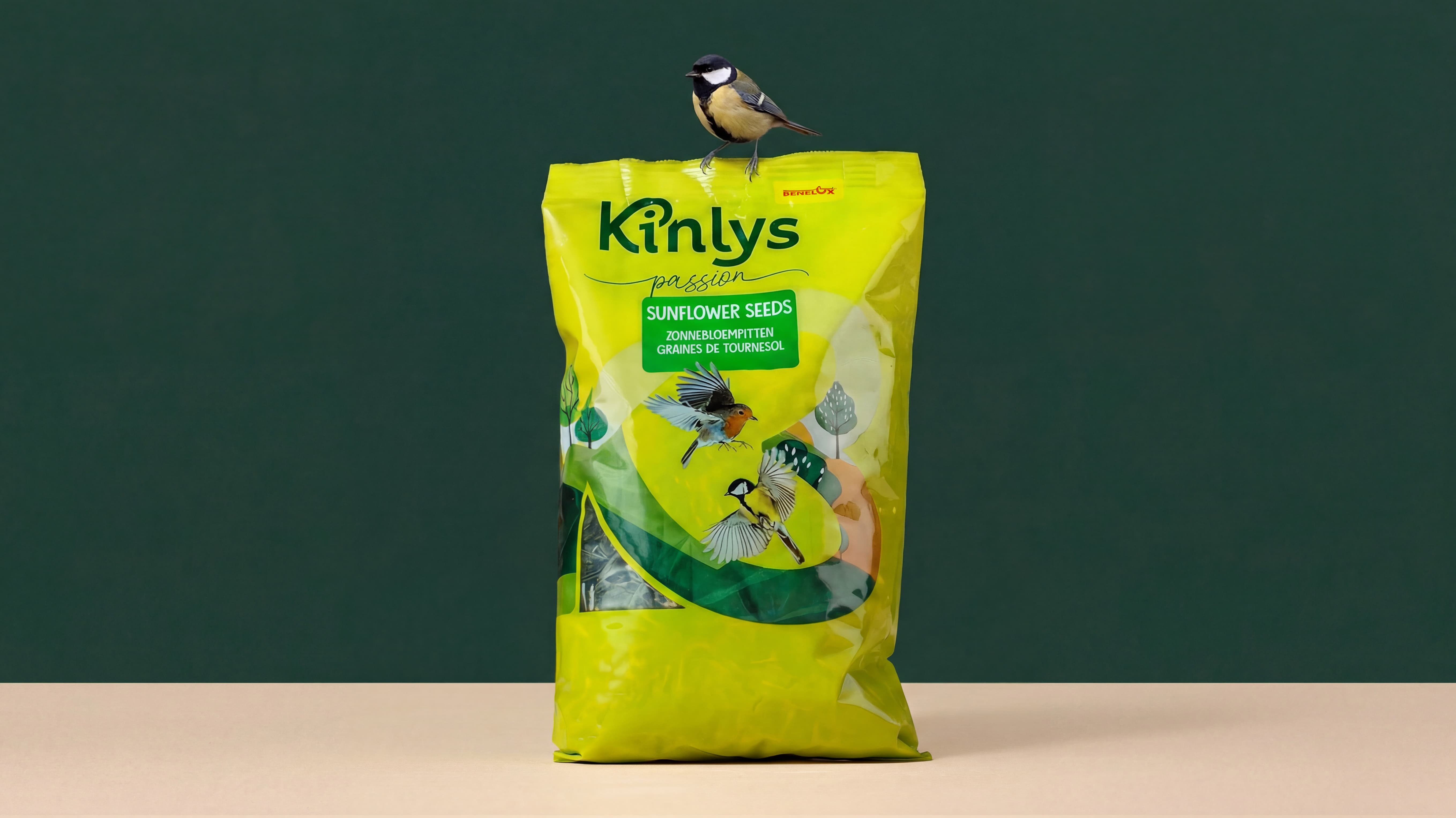

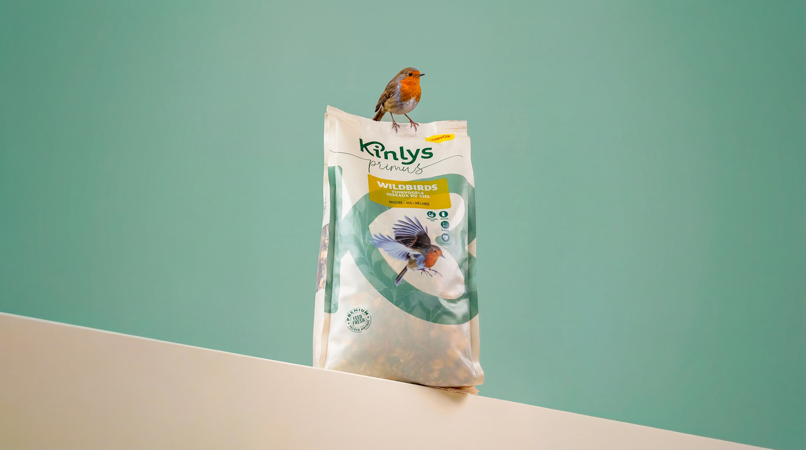
We understood that the diversity within the portfolio was both Kinlys’ greatest asset and its biggest challenge. The opportunity lay in returning to the essence of the brand: the relationship between animals, humans, and nature. From this insight, lielens developed a new global positioning, naming system, visual identity and packaging architecture centred around the purpose of rebuilding a stronger ecosystem between all three. The new structure created a clearer distinction between the ranges, with Passion designed for hobbyists and Primus aimed at more advanced users seeking premium feed with specific functional benefits.